


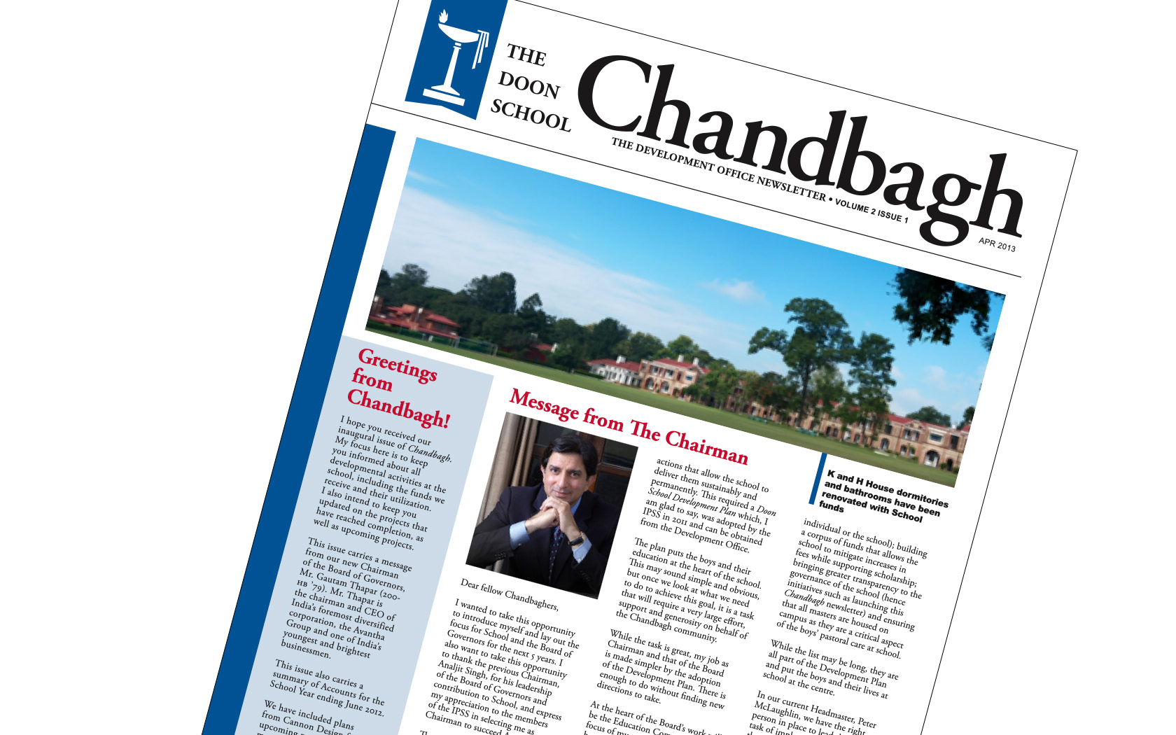
The Doon School, in Dehradun, India, reputed as one of the finest preparatory boarding schools for boys, approached us with an interesting problem. Despite high recall and an established reputation, the School faced issues identifying and differentiating itself from other schools around the country.
Within a 10-km radius, there were several knock-off schools (Doon Girl's School, Doon International School, etc), riding on the Doon School's coattails and preeminence.
On visiting the school and conducting a design audit, we found that despite a clear and defined ethos, vision and mission, the school's visual identity was undefined. There were multiple versions of the logo in active use, and in the absence of standards and style guidelines, over the school's 80-year history, creators of communication and marketing materials would refer to prior work, which itself did not conform to a predetermined visual voice.
We began in the school archives, and poured over the school's internal and external communications materials, looking for trends, standards and points of reference. Ultimately, we found the many logos in current circulation could be categorised into one of three types. We set about developing logo marks based on each of these families, and through an iterative process of development and discussion, zeroed onto the school's 'new' familiar, but fresh logo.
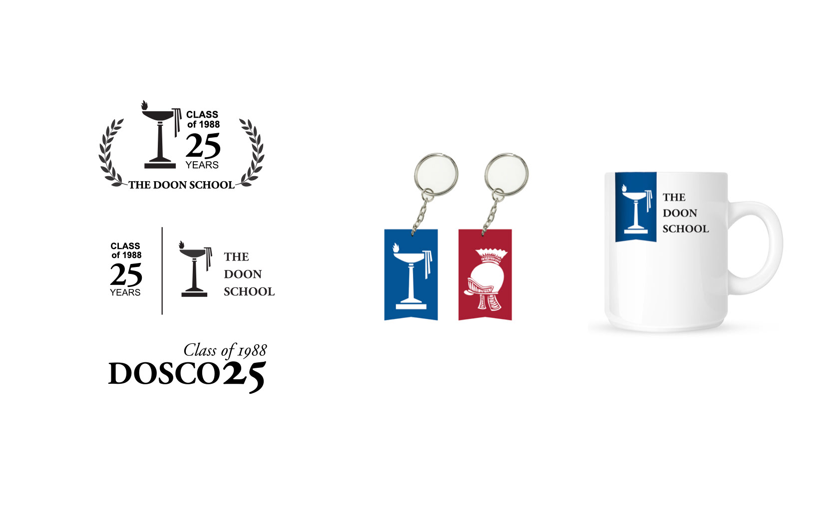
To avoid the pitfalls faced earlier, flexibility was build into the identity system. The lock-up was created in multiple aspects, ratios and a secondary version with contextual information was also created, again, with an option of aspects aspects and ratios.
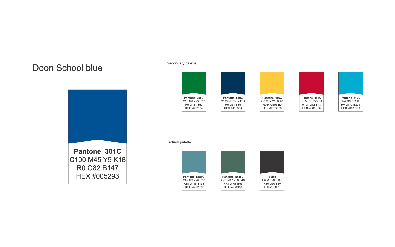
Adding colour to the logo was not as simple a matter as applying a blue brush to the logo. The heart of The Doon School, its very essence, is to encourage each boy to discover where his true chance of greatness lies. This is accomplished by a system of student leadership, reward and acknowledgement. From House Captains and Prefects to School Captains and Prefects, House Colours, Sports Colours, Games Blazers and Scholars Blazers, there are many opportunities and paths for young men to find accolades and achievements, and through this, discover their individual genius.
This essence of The Doon School's ethos, was incorporated into the visual identity, by sliding a blue ribbon behind the lamp.
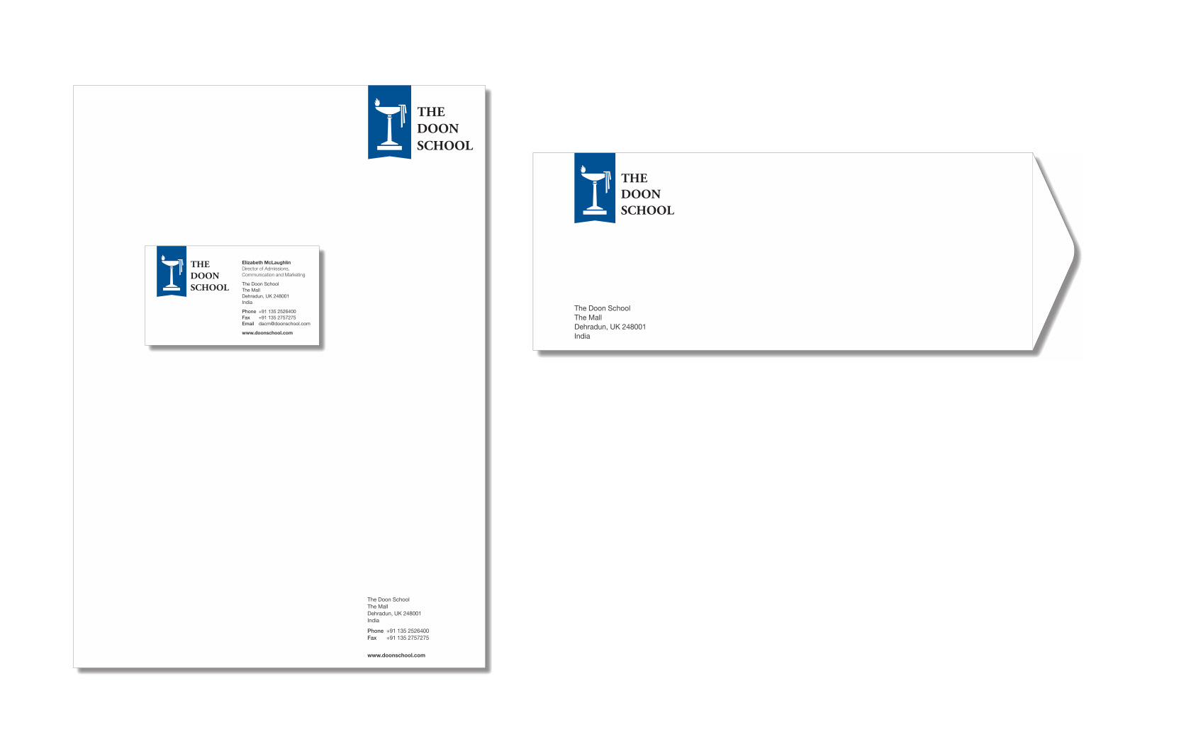
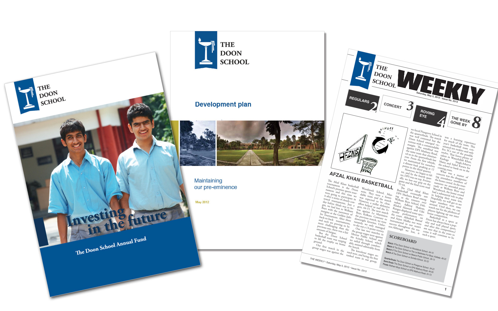
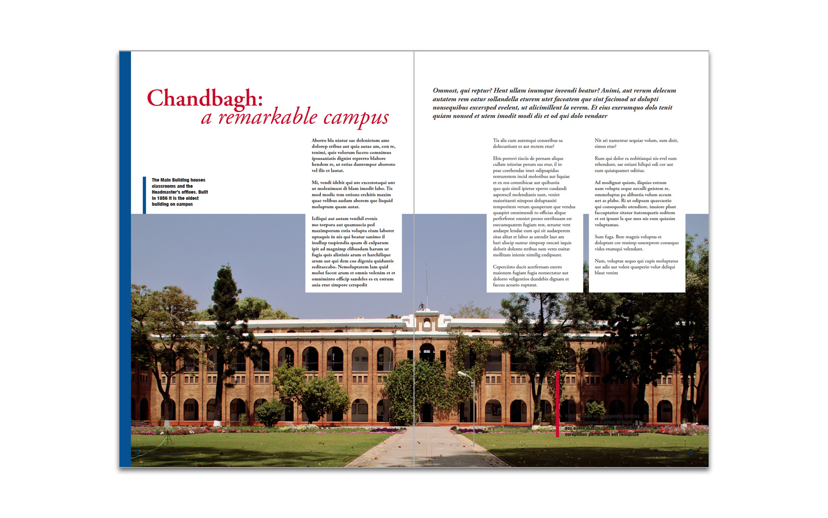
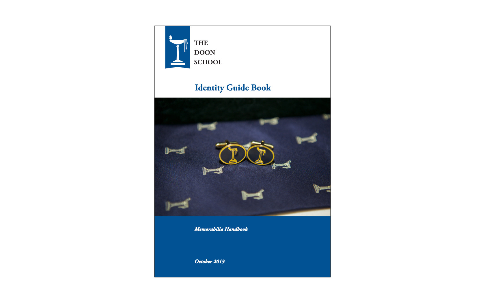
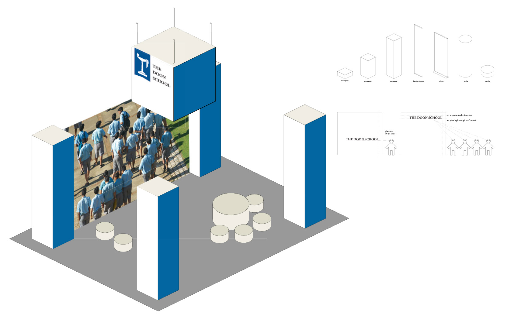
Thereafter, an implementation schedule was created, and all communications materials were redesigned to align with the new parameters. So as to curtail costs, materials were only produced once existing supplies had run out, as such even the implementation of the identity took about a year. We created a new website, merchandise and merchandising guidelines, brand books around print, digital, exhibitions and photography and trained the school's internal staff and external vendors.